The Challenge
The launch depended on converting paid and organic traffic into signups, but the existing page was slow, buried the call to action, and gave visitors no reason to act. Every visitor lost was paid-for traffic wasted.
Our Approach
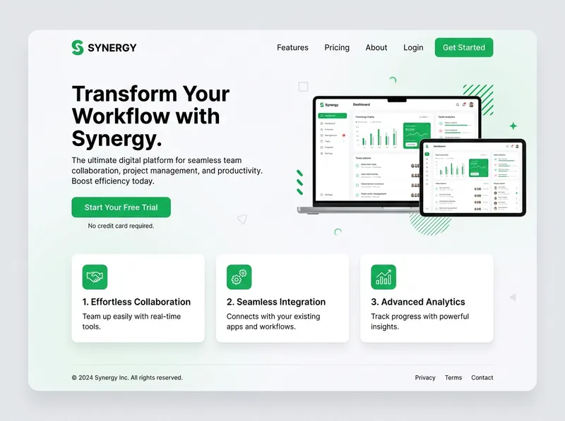
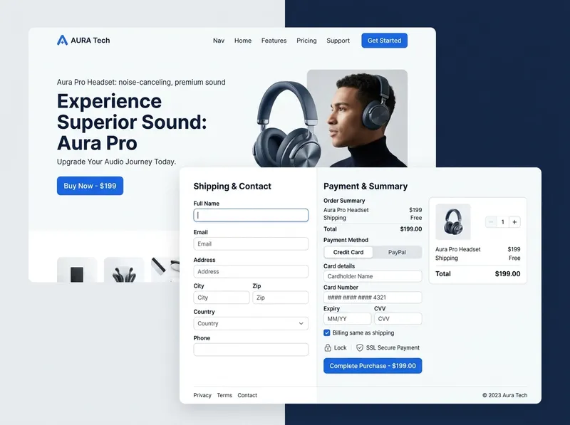
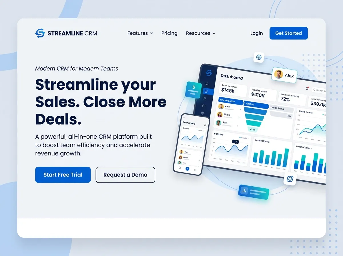
We rebuilt the page conversion-first: a clear value proposition above the fold, feature and benefit sections that answer the skeptic, a persistent call to action, and analytics configured from day one to measure what converts.
What We Built
Conversion-Focused Layout
Hierarchy and CTAs designed for one action: sign up.
Feature & Benefit Sections
The product's value explained in the visitor's language.
Clear Call to Action
A primary CTA that is visible without scrolling away from it.
Analytics & Event Tracking
Signups and engagement measured from launch day.
Performance-Optimized Code
Fast load times on desktop and mobile.
Responsive Design
Pixel-perfect on every device and browser.
The Outcome
The page now loads fast, communicates the product's value quickly, and routes every visitor toward signup — with the analytics in place to prove which sections are working.
Key Results
- Faster Page, Faster Decisions — Visitors see the value proposition immediately.
- Measured, Not Guessed — Signup events and engagement are tracked from launch.
- Mobile-First Quality — The page performs where most traffic lands.